Business Card - with final logo (see process below)
Sister Can Designs
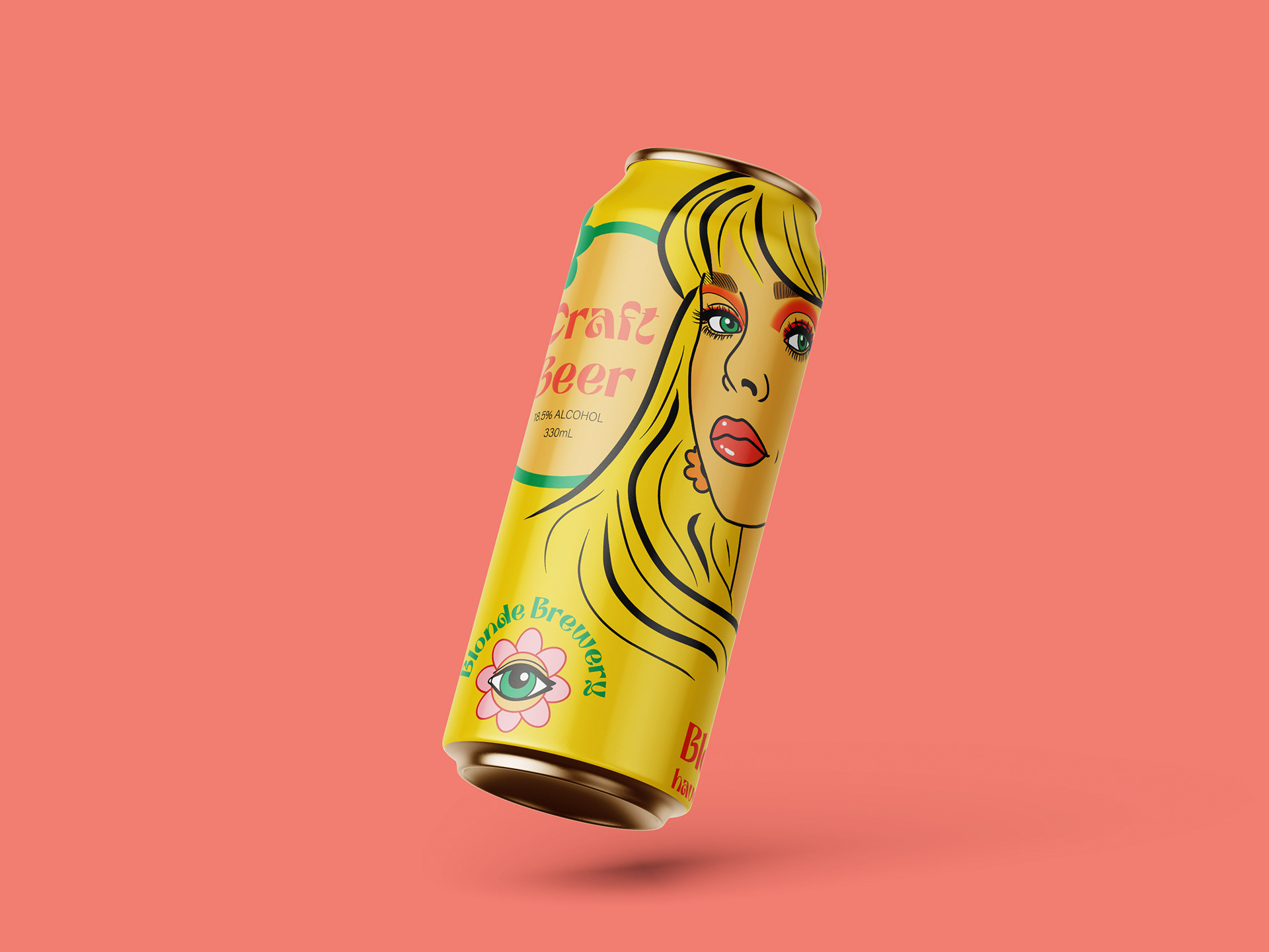
While I had created a logo that I felt communicated the spiritual, groovy side of the Brewery, a yellow (blonde) background seemed necessary to link clearly with the brand name.
Both female portraits were drawn by myself on Procreate. I initially drew the portrait directly above first and felt that it was a very cliche, stereotypical response to a 'Blonde Bombshell'. I decided I needed another Blonde, as any woman can be a Blonde if she chooses.
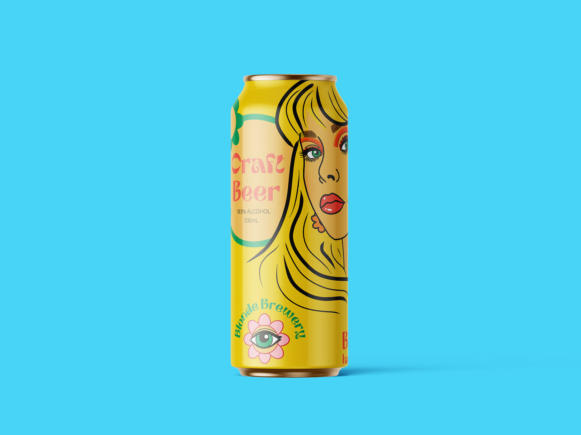
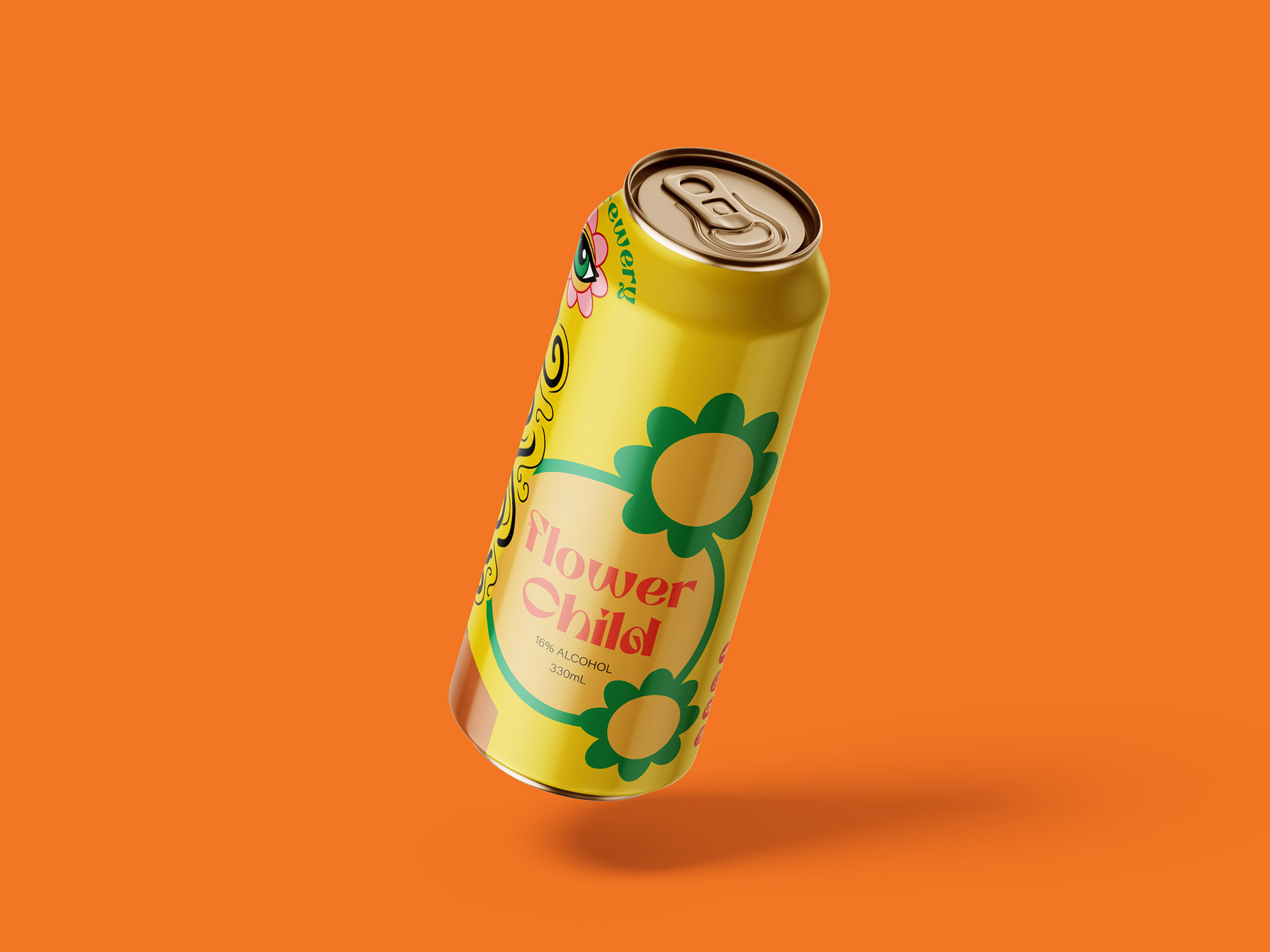

Additional Design of Coasters
The beginning of the design process started on the app Procreate on my iPad, where I annotated the original post from Instagram in order to generate ideas.
After some initial ideas I compiled a mood board on Pinterest, focusing on the posts use of the words 'sunny' and 'funky'.
From Procreate I was able to transition to Adobe Illustrator, refining my ideas to a few that I felt would represent the brand best and convey their ideals.
I was further able to experiment with different texts inspired by the late 60s and early 70s, while maintaining the desired colour palette.
